Know your numbers before your accountant does.
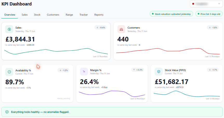
Yesterday’s trading on one screen per store — sales, customers, average basket, availability, margin and stock value, each against the same day last week. Built from your own EPOS data, ready before you’ve had your first coffee.
A number with no context isn’t information.
Most EPOS reporting gives you a figure and leaves the thinking to you. Up on what? Down by how much? And was the takings up because margin was given away? The bits that tell you whether to act are exactly the bits that go missing:
The numbers that actually run a shop.
Sales vs last week
Yesterday's takings next to the same day last week, per store — direction, not just a number.
Cash margin & margin %
Sales going up means nothing if margin's leaking. Both tracked, side by side.
Customer count & basket
How many came in and what they spent on average — the two numbers behind the takings.
Availability
What share of your range was actually on the shelf to be sold.
Stock value
What's tied up in stock right now, so you can see overstock and dead lines.
Per store, not blended
Each shop on its own screen — a group total hides which store is the problem.
Why this one’s different.
I’m Paul. I run an independent convenience store, and before that my business partner and I ran a 23-store group for private-equity investors. At that scale you get a head office that turns the till data into a morning dashboard. On your own, you get a pile of EPOS reports and a spreadsheet.
So I built the dashboard I used to have. It reads the same files my till already produces and lays out each store’s trading against last week — sales, margin, basket, availability, stock value — so the first thing I see each morning is what changed, not a raw number I have to interpret. Margin sits right next to sales on purpose, because a good sales day with the margin given away isn’t a good day.
It runs four shops this way every morning — mine and my partner’s three. Each store on its own screen, because a blended group figure never once told me which shop needed me.
Common questions
What does the RetailAce KPI dashboard show?
Yesterday's trading on one screen per store: sales, customer count, average basket, availability, cash margin and stock value — each shown against the same day last week so you can see at a glance whether you're up or down, not just what the number is.
Does it work across multiple stores?
Yes. Each store has its own dashboard, and it runs four stores across two separate businesses today. You see each shop on its own screen rather than a blended group total that hides which store is the problem.
Where does the data come from?
It reads your EPOS data — the same daily and weekly sales, department and stock files your till system already produces — and turns them into KPIs automatically, so there's nothing to type in by hand each morning.
Can it show margin, not just sales?
Yes, and that's the point. Sales going up means little if margin is leaking. The dashboard tracks cash margin and margin percentage alongside sales, plus stock value and availability, so you see the whole picture rather than a vanity number.
How is this different from the reports my EPOS already gives me?
EPOS reports tend to be one store, one report, one number at a time, with no comparison and no context. This pulls them together per store, compares to last week automatically, and surfaces what's changed — built by a retailer who got tired of stitching that together by hand every morning.
How do I get it for my shop?
Email Paul at paul@kpmconvenience.co.uk. It goes straight to a retailer, not a sales team. Tell him about your shop and he'll reply himself.
Want this on your screen each morning?
Email me. It goes straight to me, not a sales team — there isn’t one. Tell me about your shop and what you wish you could see at a glance, and I’ll reply myself.
paul@kpmconvenience.co.uk